This line is a visual separation between the configuration section and the area where the messages are displayed. If you take a look at the other sections you'll notice a similar line above the 'Apply'-button. In this case, with only one "Clear"-button, this does indeed look a little bit weird, but it is intended.
Please note that we are in the process of tuning the visuals, and that this line will appear much lighter in the next version (8.910).
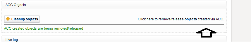


